This post on LinkedIn shares the data-to-viz.com web site that helps find the best visualization depending on the data itself. It is based on the number of numeric variables, (1,2,3, several) but can also be organized by category, both number and category, time series and more.
Further more there are sample code in R, Python, D3.js and React offered for each option.
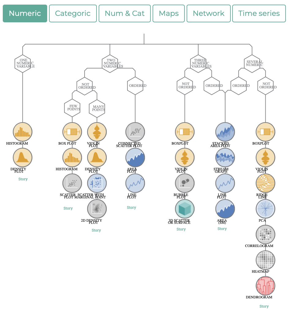
Here is some of the text of the original post by Giannis Tolios: (links decoded from LinkedIn short URL.)
𝗙𝗶𝗻𝗱 𝘁𝗵𝗲 𝗕𝗲𝘀𝘁 𝗩𝗶𝘀𝘂𝗮𝗹𝗶𝘇𝗮𝘁𝗶𝗼𝗻 𝗳𝗼𝗿 𝘆𝗼𝘂𝗿 𝗗𝗮𝘁𝗮! 💡📊
Have you ever looked for the best plots to visualize a dataset? From Data to Viz is a website helping with that, by offering handy diagrams for various data types! Furthermore, clicking on each visualization type provides a brief description, as well as code examples in Python and R. This website can be a valuable guide for beginners, as well as experts creating advanced visualizations in the programming language of their preference. Check the links below for more information, and make sure to follow me for regular data science content!
𝗙𝗿𝗼𝗺 𝗗𝗮𝘁𝗮 𝘁𝗼 𝗩𝗶𝘇 𝘄𝗲𝗯𝘀𝗶𝘁𝗲: https://www.data-to-viz.com
𝗟𝗲𝗮𝗿𝗻 𝗠𝗟 𝗮𝗻𝗱 𝗧𝗶𝗺𝗲 𝗦𝗲𝗿𝗶𝗲𝘀 𝗙𝗼𝗿𝗲𝗰𝗮𝘀𝘁𝗶𝗻𝗴 𝘄𝗶𝘁𝗵 𝗣𝘆𝗖𝗮𝗿𝗲𝘁📚: https://leanpub.com/pycaretbook/
[…]