This BBC presentation made in partnership with the (British) Royal Society
https://www.bbc.co.uk/ideas/videos/five-charts-that-changed-the-world/p0fb69c1
provides insights on 6 History-changing scientific illustrations, from the XIX to the XXIrst centuries.
- First Pie Chart by Scottish political economist William Playfair
- Surgeon John Snow map pointing out the Cholera infection in SoHo, London, 1854
- Florence Nightingale created the “Coxcomb” uneven pie chart, pointing out unsanitary conditions in hospitals during the Crimean War, and persuaded Queen Victoria.
- W.E.B Du Bois (American historian and civil rights activist) presented a series of hand-made charts at the 1900 Paris World’s Fair, showcasing the educational, social and business accomplishments of black Americans in the 35 years since slavery had been officially abolished.
- Spreading misinformation: the Kallikak family tree, “fake news” created by American psychologist and eugenicist Henry Goddard.
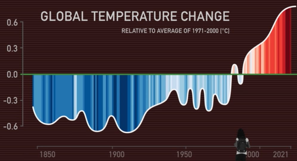
- In 2018, scientist Ed Hawkins was invited to give a speech about climate change at Hay, a literary festival in Wales. He needed to convey the increase in global average temperatures to a largely non-scientific audience. So, he devised a chart that used no words, just colours.